Ontarians on the Move, 2021 Edition. #10 — The pre-pandemic correlation between home price increases and population growth in Southern Ontario
Tenth in (what I hope) will be a series on population growth, migration, and what’s going on with Ontario’s housing market. Previous piece: #9 — The simple explanation is that population growth caused Ontario real-estate prices to boom before the pandemic. Here’s the more complex answer.
TL;DR version: Between 2005 and 2019, there is a strong correlation between population growth and home price increases in Southern Ontario, though other factors are clearly in play. This correlation gets stronger the further away you get from Toronto, where the effects of drive until you qualify are clearly visible.
Before we get into the data, there’s an important caveat:
This story and this series are about the pre-pandemic run-up in real-estate prices. The dynamics driving the 30%+ price growth we’ve seen in some markets during the pandemic are due to entirely different factors. What we’ve experienced since March 2020 is due to a combination of ridiculously low-interest rates and white-collar professionals with too much savings in their hands buying up everything from Bitcoin to retro video games to vintage hockey cards to housing, causing the prices of all these to absolutely skyrocket. Is anyone interested in buying a Steve Yzerman rookie card? Call me.
There’s still a lot of skepticism around the idea, despite entries one through nine of this series, that population growth from international migration might be related to the pre-pandemic home price escalation Southern (particularly Southwestern) Ontario experienced from 2016–20.
I thought it would be enlightening to directly compare the two at the local level. So I went out and got some data.
From the series Population estimates, July 1, by census metropolitan area and census agglomeration, 2016 boundaries, I calculated yearly percentage population growth for 11 communities across Ontario. These include Toronto CMA (metro Toronto), eight communities in Southern Ontario, and Ottawa (Ontario part only) and North Bay as controls. Here’s the yearly data:

Here “2019” represents the change from July 1, 2018 to July 1, 2019.
Then I downloaded home price data from the Canadian Real Estate Association (CREA). I calculated the change of the value of a single-family home from July-to-July of each year. Here are those results:

Before we compare the data, there are a few big caveats.
First, correlation is not necessarily causation. I know if I don’t point this out, others will.
Second, I used single-family home prices. There are other home price metrics I could have used, which may yield slightly different results.
Third, the Statistics Canada and CREA geographic definitions are not aligned. So “Woodstock (CMA)” likely does not have the same geographic boundaries as “Woodstock Ingersoll” from the home price data. Here are the specific geographies I used:

In short, this isn’t exactly a methodology that would get accepted in a peer-reviewed journal, but for our purposes, it’ll do.
Let’s go through our communities, from lowest to greatest positive correlation.
Toronto (R² = 0.2907, but in wrong direction)

Uh oh.
I’ve noticed that the Ontarians most skeptical of the population growth/home price story are from Toronto. This may explain why: the correlation runs in the opposing direction of what we’d predict. And in Toronto CMA, 2016 and 2017 were not particularly high population growth years, as an increase in the influx of new residents was offset by an outmigration to other parts of the province (a.k.a. drive until you qualify).
I think I finally understand where the skepticism is coming from.
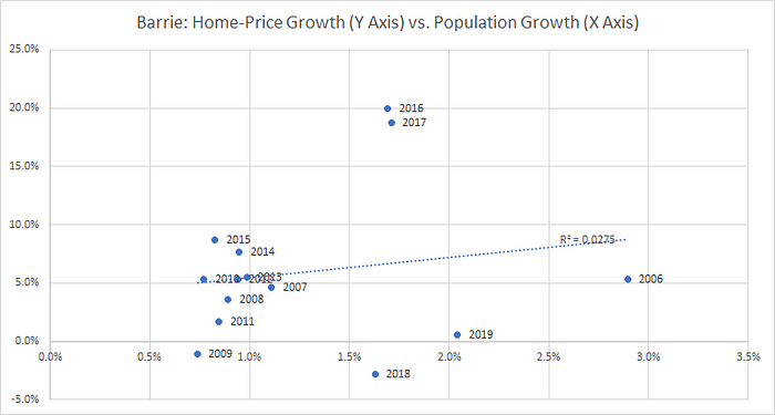
Barrie (R² = 0.0275)

This chart is fascinating because it shows both the population growth of 2016–19 and the booming home prices of the period. But as the (basically zero) R² shows, the relationship is a complicated one.
From the many conversations I’ve had with real estate agents and home builders, here’s my best guess on what happened. Population growth around 2015–16 did start to push home prices up. Once home prices started rising, the investors, speculators, and fear-of-missing-out folks started buying like mad, driving prices to the stratosphere. The bubble burst in late 2017, in part due to the regulatory changes we discussed in the previous piece, killing off the irrational exuberance. However, continued robust population growth kept prices flat, rather than falling substantially in late 1980s style correction.
In short, the price increases that should have happened from 2018–19 population growth were pushed ahead by speculators, investors, and FOMOs in 2016–17. It’s a trend we’ll see in other communities.
Hamilton (R² = 0.1085)

Fairly weak correlation here, though we see the four highest population growth years (in percentage terms) are the four from 2016–19. The dynamics here look to be a much weaker version of Barrie’s — home price growth faster than you’d expect in 2016 and 2017, and slower in 2018 and 2019. And even that “slow” growth of those two years is still around 5% per annum.
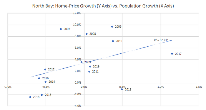
North Bay (R² = 0.1911)

I put North Bay in as a control, as it is too far away from Toronto to experience the effect of drive until you qualify and the musical chairs effect. As well, it did not experience much in the way of direct population growth from international migration.
Does anyone know the story of what happened in 2017, which is the one year that saw robust population growth? (Which, recall, is population growth from July 1, 2016 to July 1, 2017). Wonder if it’s from Syrian refugees?
Tillsonburg (R² = 0.2521)

I expected to see a stronger correlation in the Tillsonburg numbers; I wonder if sample-size issues has something to do with it (the small size of the community can throw off both the population growth estimates and the home price growth estimates). I suspect that’s the case, seeing as we’ll see a similar trend with Woodstock.
Unlike Barrie and Hamilton, we don’t see home price growth that gets out in front of population growth.
Also note that the population growth in Tillsonburg doesn’t start until 2017, whereas in most other Southwestern Ontario communities it starts in 2016. I believe this is the musical chairs effect in play; it took a bit longer for the wave of population growth, centred at the CN Tower, to reach Tillsonburg.
Woodstock (R² = 0.2657)

Woodstock’s graph looks a whole lot like Tillsonburg’s, though we see much more rapid price appreciation in 2017. Like Tillsonburg, population growth comes somewhat later to the community than we see in, say, Hamilton.
Guelph (R² = 0.2850)

There is far less space between the population growth rates of 2016–19 and other years in Guelph than there is in other Southwestern Ontario communities (like Brantford, which we’ll see in a moment). Like in Barrie and Hamilton, 2017’s skyrocketing home prices were followed by a cool year in 2018.
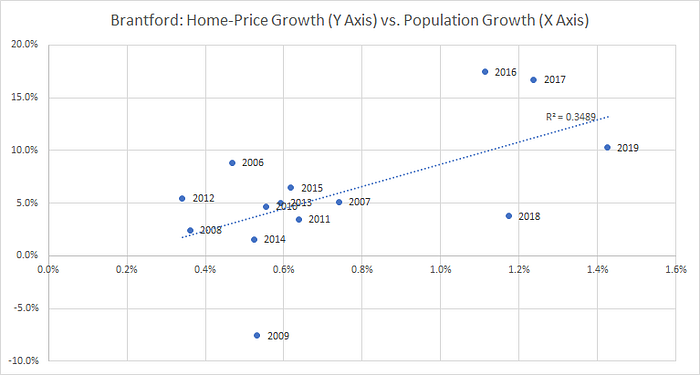
Brantford (R² = 0.3489)

When I think of Southwestern Ontario population growth, this is the kind of thing I picture in my mind. Much higher rates of population growth after 2015 than before it. Home price growth looks somewhat similar to Hamilton, with huge price increases in 2016 and 2017, with a much slower (but still double the rate of inflation) year in 2018. The slow home price growth would not last for long, as 2019 was another year of double-digit growth.
Ottawa (R² = 0.3850)

Ottawa was my other control, as it is too far away from Toronto to experience the dual effects of drive until you qualify and the musical chairs effect. Unlike North Bay, however, it still experienced significant population growth from migration, with yearly growth rates above 2% after 2016.
Note the Y-axis here; unlike the other communities on our list, the city did not experience double-digit home price increases in any year. Instead, growth was fairly consistent through the period, and somewhat correlated with population growth.
Note that 2016 and 2017 were relatively weak years for home price growth in Ottawa, relative to population growth. It shows how much the GTA home price bubble (and subsequent flat market) was a regional phenomenon.
Kitchener-Waterloo (R² = 0.4312)

Unlike the other communities in our chart, 2006, the height of the Blackberry era, was a particularly robust year for population growth in the community. Excluding that year, annual population growth rates were twice as high in 2016–19 than they were in previous years.
Similar to the GTA, Kitchener-Waterloo saw very high home price growth in 2016 and 2017, followed by leaner years in 2018 and 2019. Note those “leaner” years were still 8.4% and 6.7% respectively. How many other markets can we say that price growth that runs at three-to-five times the rate of inflation is the sign of a bubble bursting?
Niagara (R² = 0.4401)

Have we noticed a trend yet? High population growth rates in 2016, 2017, 2018, 2019. Exceptionally high home price growth in 2016 and 2017, followed by still strong growth in 2018 and 2019.
I need to turn that into a keyboard macro so I don’t need to keep typing it over and over.
London-St. Thomas (R² = 0.9134)

I’m from London, I’ve lived in London almost my entire life (outside of a handful of years spent in Ottawa, Kingston, Rochester NY, and Maastricht NL). I tend to view geographic issues through the lens of a Londoner.
The graph above, with the R² of 0.9134, probably explains why I emphasize (and arguably overemphasize) the population growth story. In short, it’s exactly what happened in my hometown, and we experienced it first hand when we sold our home in 2017.
In short, we’re all creatures of our environments, and this one is mine.
In Summary
Some thoughts to close on:
- In the Toronto market, there is no visible link between population growth and home price increases, and, if anything, the relationship is the opposite of what we expect. Unlike much of Southern Ontario, population growth in 2016–19 wasn’t particularly robust, as an increase in international migrants was offset by population growth to the rest of the province, thanks in part to drive until you qualify.
- There is a strong relationship between home price growth and population growth, but it’s not a particularly neat one. In markets 100km or less from Toronto, the home price growth due to population growth was driven up higher through the actions of investors, speculators, and FOMOs. This caused a “correction” in 2018–19, but in many instances, that correction was still prices rising faster than inflation.
- In communities more than 100km from Toronto, we didn’t see that home price growth bubble in 2016–17, and the correlation between population growth and home price growth was tighter.
- London’s different, man.
